Gmail New View Web Redesign will Start Rolling out Next Week
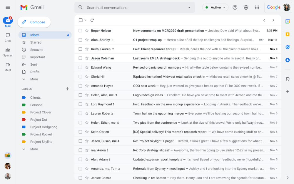
The new redesign will include a new left sidebar that features large, pill-shaped icons for Mail, Chat, Spaces, and Meet. You also get recent chat heads at the bottom of the screen. After enabling, you can easily move around between your inbox, conversations, and join meetings without having to switch between tabs or open a new window.
See Also: Google Announces A New Replacement for Third-Party Cookies Furthermore, The next column is specific to the current product/service you’re viewing. In the case of Gmail, it’s the “full array of Mail and Label options currently available,” including a blue “Compose” button that interestingly replaces the previous red accent color. You’ll notice various elements, including the inbox list, now feature curved corners. For Spaces, it’s the ability to “Browse,” see “Pinned,” and view all conversations. Additionally, Google adds “Notification bubbles” that “make it easy to stay on top of what immediately needs your attention.” Unfortunately, the Google Chat conversations list can no longer be configured to appear on the right side of Gmail. Meanwhile, an upcoming update will combine email and chat results in the top bar. The new redesign will go on testing from February 8. Users can “revert to classic Gmail via settings.” The new version will start rolling out automatically in April. If you do not like the new design you can go back to the old design. Google will fully remove Gmail’s previous look and use the new view redesign by the end of Q2 2022. Check Also: Top 8 Tips and Tricks for Google Chrome on the Desktop
